Stand-Up Pouch Artwork: How to Set Up Your Dieline, Panels and Proof
Good artwork for stand up pouches starts with the dieline, not the logo. Custom Stand-Up Pouches sends a dieline for your exact pouch style, and you place the front panel, back panel and bottom gusset inside its safe zones, away from seals, zippers, tear notches and valves. A free mockup comes back within 24 hours, and nothing prints until you approve it.
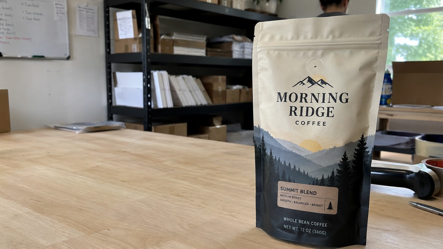
- Every pouch style has its own dieline with seal, zipper and notch zones marked
- The bottom gusset folds under the pouch, so artwork there reads only from below
- Clear windows and valves need artwork-free zones planned from the start
- Free mockup within 24 hours, unlimited free revisions, minimum order 12
- Pay nothing until you approve the design; standard turnaround about 2 weeks
What is a dieline and why do stand up pouches need one?
A dieline is the flat, unfolded map of your stand up pouches, showing every edge, seal, fold and feature in the exact place it will land on the finished bag. Artwork that ignores the dieline can lose text under a heat seal, split a logo across the gusset fold, or print a barcode where the zipper sits.
Stand up pouches are more complicated than a box or a label because the film wraps around a product, folds at the bottom and is sealed along several edges. The front and back panels look flat on screen, but on the shelf they bow outward when the pouch is filled. The bottom gusset is a separate folded panel that most shoppers only see when they pick the pouch up.
Custom Stand-Up Pouches provides the dieline for the specific style you order, whether that is a matte kraft pouch, a coffee pouch with a degassing valve or a spouted liquid pouch. Start every design from that file rather than from a generic template, because zipper height, notch position and seal widths change from style to style.
How should I lay out the front panel, back panel and gusset?
The front panel of stand up pouches carries brand, product name and the single reason to buy; the back panel carries the story, directions, ingredients and barcode; the bottom gusset is for a pattern, a color flood or a short secondary message. Treat each panel as its own job with its own reading distance.
| Panel | What belongs there | What to avoid |
|---|---|---|
| Front panel | Logo, product name, flavor or variety, one key claim, net contents line if your category requires it | Small type near the side seals, crowded claims, critical text above the zipper line |
| Back panel | Brand story, directions, ingredients or contents, barcode, contact details, recycling or disposal note | Barcodes over seams or curves, fine print in light ink on kraft |
| Bottom gusset | Background color, repeating pattern, web address or tagline | Anything essential, since the gusset folds and is rarely seen at eye level |
| Top area above zipper | Color flood or simple pattern that continues the design | Logos or copy, because shoppers or customers tear this strip away |
Keep the visual center of the front panel slightly above the middle. When stand up pouches are filled, the lower half bulges more than the top, which stretches anything printed low on the bag.
Where are the no-print and safe zones on stand up pouches?
Safe zones on stand up pouches are the areas inside the dieline where important artwork can sit without being sealed over, cut off or hidden by a feature. The dieline from Custom Stand-Up Pouches marks these zones, and your proof shows them again so you can confirm nothing critical crosses a line.
The areas that need attention on almost every order are:
- Side and top seals: the heat-sealed edges are pressed flat and often textured, so text there is distorted or lost. Extend background color into the seals, but keep words and logos inside.
- Zipper line: the press-to-close track creates a raised ridge across the bag. Keep copy clear of it on both panels.
- Tear notches: small cuts near the top edge where the customer opens the pouch. Nothing important should sit right beside them.
- Valve position: on coffee pouches the one-way degassing valve sits on the front or back panel and is a fixed shape. Design around it or frame it as part of the layout.
- Hang hole: if you add a round or sombrero hang hole, the punched area removes artwork completely.
- Gusset fold: the crease where the bottom folds in. Text that crosses it will look broken.
Bleed matters too. Extend background colors past the trim line shown on the dieline so no thin unprinted edge appears after cutting.
How do clear windows change the artwork on stand up pouches?
A clear window on stand up pouches is an area where no ink is printed, so the product itself becomes part of the design. That means the window has to be planned in the artwork from the first draft, with its shape, position and what shows through all decided together.
On a clear-window snack pouch, the window usually sits in the center or lower front panel, where the product settles after filling. Place the window too high and shoppers see empty space or the top of a half-settled bag. Place it over a seal or across the gusset fold and it will not read as a clean window at all.
Things to decide before you send files:
- Window shape: a simple rectangle, rounded shape or a custom shape that echoes your logo.
- Whether a white ink layer sits behind your colors everywhere except the window, which keeps colors bright on clear or metallic film.
- What the product looks like through the film, since a dark product changes how surrounding colors read.
- How copy wraps around the window without crowding it.
Mark the window on your artwork as a separate layer or a clearly labeled shape. The 24-hour mockup from Custom Stand-Up Pouches will show the window in place so you can judge the balance before approving.
How do kraft, matte and metallic films affect my colors?
The film under the ink changes how colors look on stand up pouches. Kraft paper absorbs ink and warms every color, matte film softens contrast and reduces glare, and metallic or foil-lined film adds shine wherever a white ink layer is left out.
On a matte kraft pouch, bright colors print deeper and slightly muted, and very light colors can almost disappear against the brown surface. Bold, dark or saturated colors and simple shapes work best. If you want a crisp white logo on kraft, ask for a white ink layer under it.
On white or clear films, colors read closest to your screen, though no printed film matches a backlit monitor exactly. If your brand relies on a specific color, give the Pantone reference in your file notes, and use the mockup to check that the overall look matches what you expect. On metallic film, decide deliberately where you want the metallic sheen to show through and where you want solid color.
Fine type follows the same logic. Thin script fonts and small reversed-out text (light letters on a dark background) are the first things to fill in or blur on textured or uncoated surfaces, so keep body copy simple and sized for easy reading at arm’s length.
What should I check on the proof before I approve stand up pouches?
The proof is the last point where changes to stand up pouches cost nothing, so read it slowly against a checklist rather than glancing at the overall look. Custom Stand-Up Pouches returns a free mockup within 24 hours, offers unlimited free revisions, and you pay nothing until you approve the design.
- Spelling and legal copy: read every word on both panels aloud, including ingredients, directions and contact details.
- Barcode: confirm the number is correct and the barcode sits on a flat area of the back panel, away from seals and the gusset fold.
- Seal and zipper clearance: no text or logo crosses a seal, the zipper line or a tear notch.
- Window and valve: both are where you expect them, and the artwork around them looks intentional.
- Gusset: the bottom panel artwork is correct and nothing essential sits there.
- Variants: if you order several flavors or SKUs, check that each version has the right name, color and copy.
- Film and finish: the proof notes the film, finish and pouch style you actually want.
Ask for another revision whenever anything is unclear. A round of edits on the proof is far easier than living with a printed run of stand up pouches that carries a typo on every bag.
What are the most common artwork mistakes on stand up pouches?
Most artwork problems on stand up pouches come from designing the bag as a flat poster instead of a three-dimensional, sealed, filled package. The fixes are simple once you know where to look.
- Designing without the dieline: a layout made for a generic rectangle rarely lines up with real seals, zipper and notches.
- Low-resolution logos: a logo copied from a website looks sharp on screen and soft in print. Send vector artwork wherever you can.
- Text in the seal zone: words placed close to the edges get pressed flat and distorted.
- Forgetting the fill: filled stand up pouches bow outward, so perfect circles and straight lines low on the bag can look stretched.
- Ignoring the back panel: buyers flip the pouch over in store and online photos often show both sides. Treat the back as part of the brand, not just a place for fine print.
- Mismatched variants: a range of flavors where each pouch was designed separately ends up with logos in different places. Lock a master layout, then swap only color and variety name.
If you do not have print-ready files, Custom Stand-Up Pouches can help build the layout from your logo and copy. Either way, the order starts at a minimum of 12, standard turnaround after proof approval is about 2 weeks, and you can begin with the quote form.
Frequently asked questions
Do I need a separate dieline for each pouch style I order?
Yes, stand up pouches in different styles each need their own dieline, because zipper height, seal widths, notch position and features such as valves or spouts change from style to style. Custom Stand-Up Pouches supplies the correct dieline for every style on your order, so a matte kraft design and a coffee valve design each start from an accurate map of the finished bag.
Can artwork wrap from the front panel onto the back panel?
Artwork on stand up pouches can flow from front to back as a continuous background color or pattern, because the side seals join the two panels. Keep logos and words off the seals themselves, since the pressed edges distort anything printed there. A background that wraps cleanly makes the bag look finished from every angle on a shelf or in product photos.
Should I print anything on the bottom gusset?
The bottom gusset of stand up pouches is a good place for a color flood, a repeating pattern or a short tagline. Avoid putting essential information there, because the gusset folds underneath the bag and shoppers rarely see it at eye level. Many brands simply continue the front panel background into the gusset so the pouch looks complete when picked up or turned over.
Where should the barcode go on a printed pouch?
The barcode on stand up pouches belongs on a flat area of the back panel, away from the side seals, the gusset fold and the zipper line. Curves and creases can make a barcode hard to scan at checkout. Custom Stand-Up Pouches shows the barcode position on the mockup, so you can confirm placement and the correct number before anything goes into production.
Can a white ink layer make colors brighter on kraft or clear film?
A white ink layer under the colors on stand up pouches keeps them bright on kraft, clear or metallic film, which would otherwise show through and change the shade. You can use white everywhere, only under the logo, or everywhere except a clear window. Mention where you want white in your file notes, and the mockup will reflect the choice before approval.
How do I keep text readable near the zipper and tear notches?
Text on stand up pouches stays readable when it sits below the zipper line and away from the tear notches near the top edge. The zipper forms a raised ridge, and the strip above it is usually torn off when the customer opens the bag. Use that top strip for background color only, and keep the logo, product name and claims on the main panel.
Can each flavor or variety use the same layout with different colors?
Stand up pouches for a product range look strongest when every variety shares one master layout and only the color, variety name and a few details change. Custom Stand-Up Pouches can set up the variants from a single design, and each version appears on the proof for checking. A shared layout keeps your logo in the same place on every bag so the range reads as one brand.
Will a script or thin font print clearly on a matte kraft pouch?
Thin script fonts on stand up pouches made from matte kraft can soften or fill in, because the paper surface absorbs ink and has a natural texture. Bold lettering and simple shapes print most clearly on kraft. Keep thin scripts for large display words, and set ingredients, directions and other small copy in a clean, sturdy typeface that reads easily at arm's length.
How should I design around the degassing valve on a coffee pouch?
Coffee stand up pouches with a one-way degassing valve need artwork that leaves the valve area clear, because the valve is a fixed round fitting applied to the film. Custom Stand-Up Pouches marks the valve position on the dieline. Many roasters frame the valve with a simple ring or place it inside a plain color area so it looks deliberate rather than stuck on.
What happens if my approved artwork has a typo?
Stand up pouches print exactly what the approved proof shows, so a typo approved on the proof will appear on every bag in the run. Custom Stand-Up Pouches offers unlimited free revisions before approval and charges nothing until you sign off, which is why reading every word on the mockup, including ingredients and contact details, is the most valuable check you can make.
Can I design the back panel later and approve the front first?
Stand up pouches are proofed and printed as one complete design, so both panels and the gusset need final artwork before approval. You can send the front first and refine it while you finish the back panel copy, and the mockups will update with each revision. Production starts only after the full pouch is approved, with standard turnaround of about 2 weeks.
Get a free mockup for your stand up pouches
Send your logo or idea and the quantity you have in mind. Custom Stand-Up Pouches returns a free mockup within 24 hours, you approve the design before anything is produced, and standard turnaround is about two weeks with faster options available. Get a custom quote.
Win Free Stuff
Enter below for a chance to win plus receive 10% off your first order.
🎉 You are in!
We will text you your 10% off code. Good luck!